Branding, visual identity · 2024
Studio 113
Tap to open
Story time
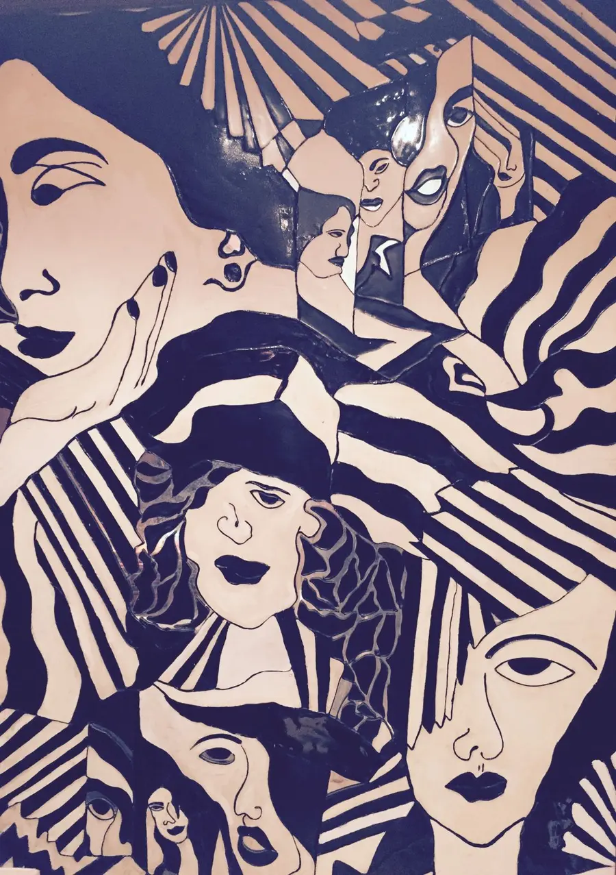
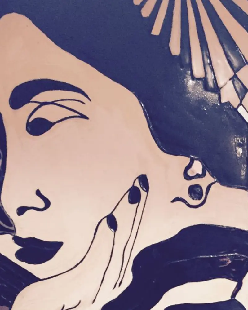
Lady K is the face of Studio 113. She steps out of a vintage mural that has hung in the House of Kanchana store at 113 Park Street, Calcutta, for decades. The House has dressed the city since 1967, and Studio 113 is its newest label.
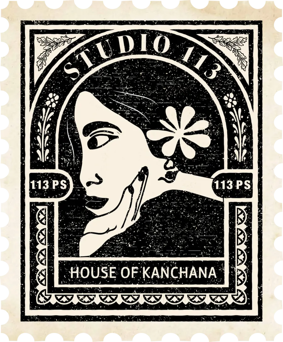
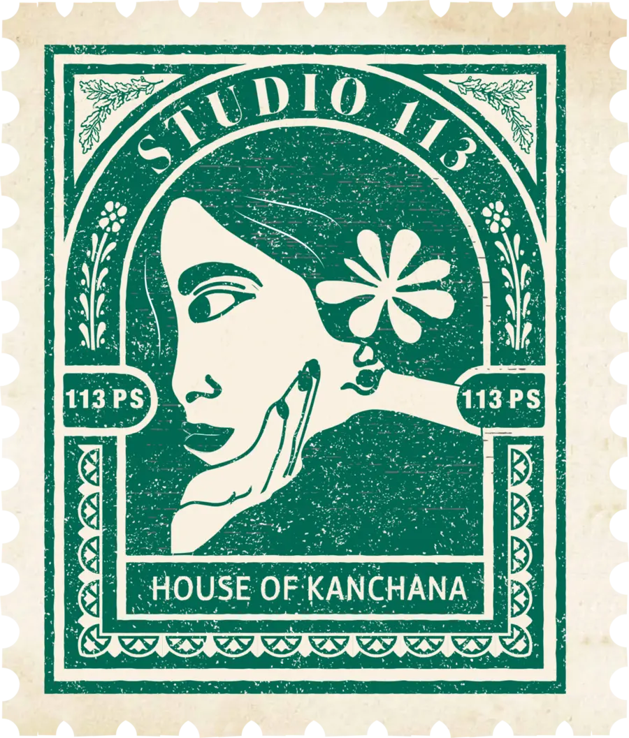
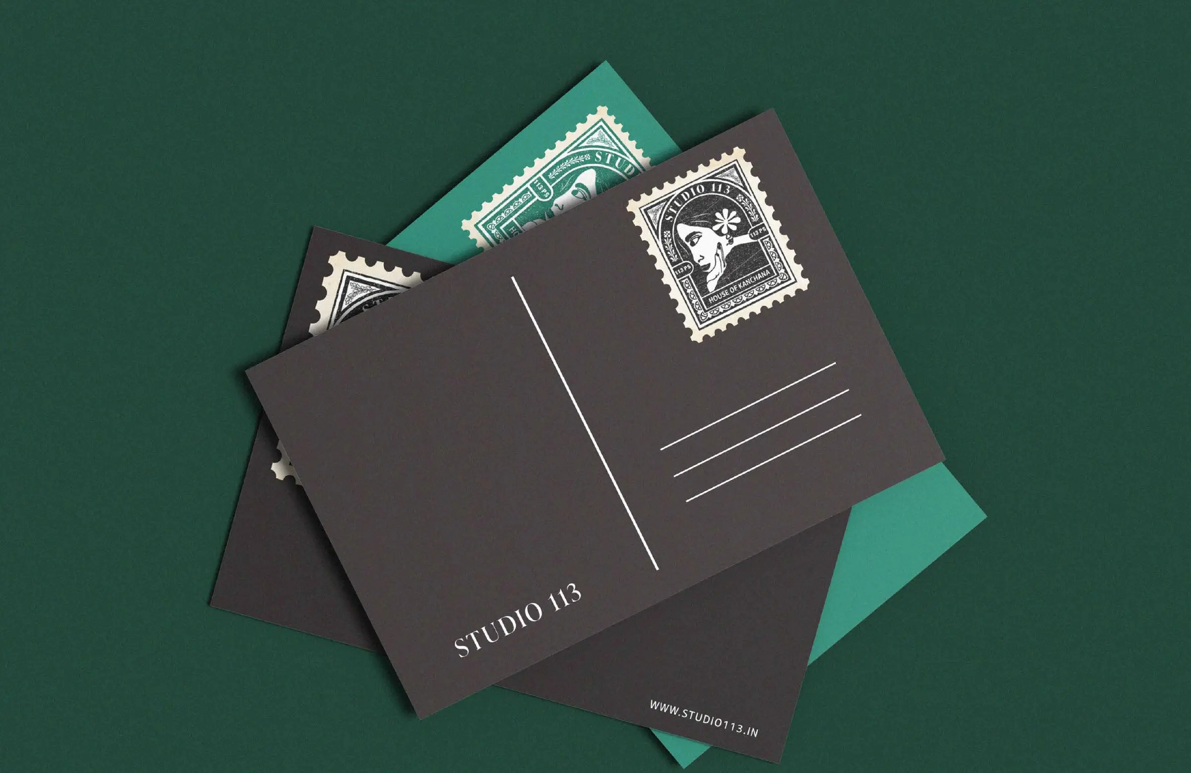
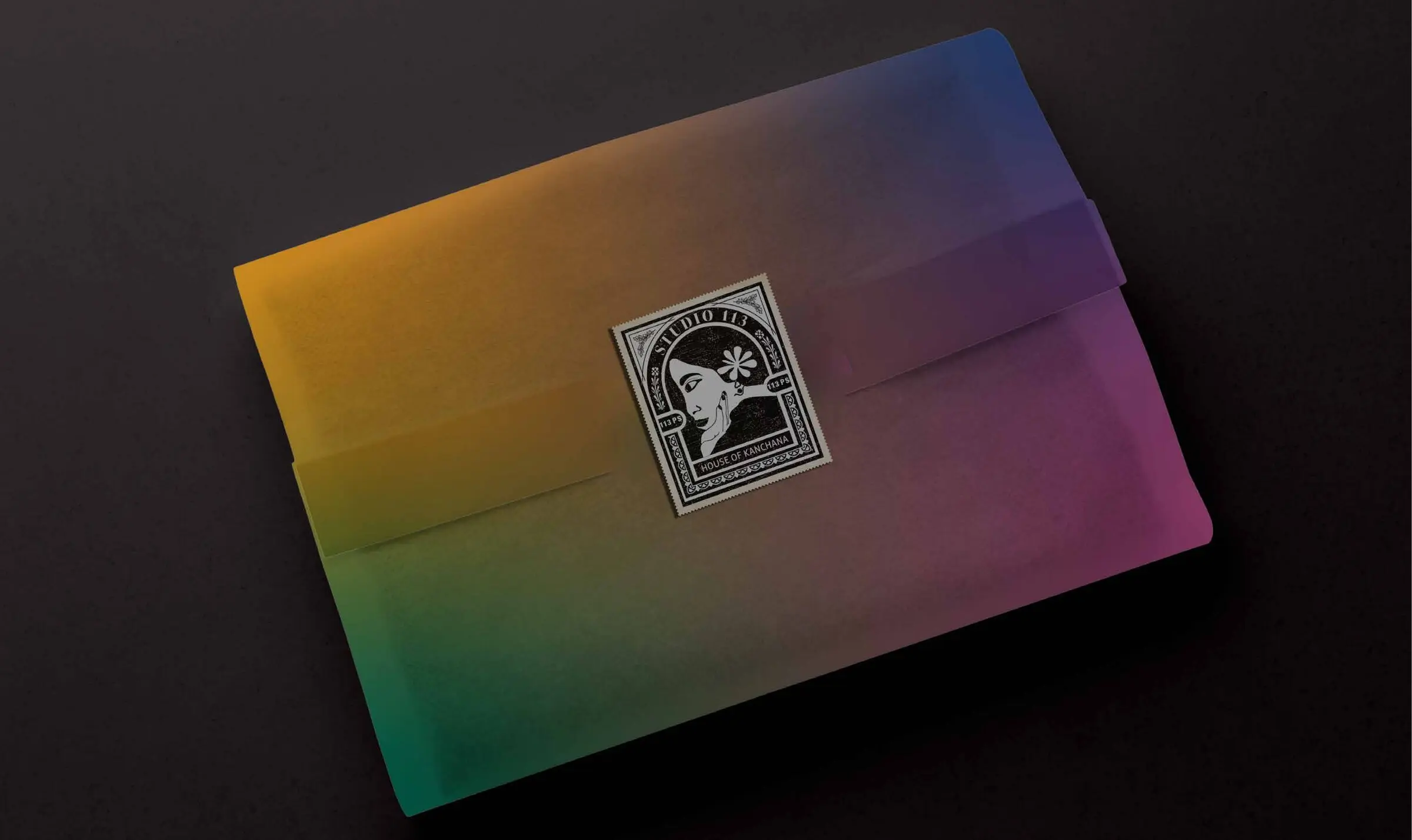
The logo turns her into a postage stamp, after the ornate frames of vintage Indian stamps: her profile from the mural inside an arched window, a flower in her hair, the address 113 Park Street written as the stamp's value, and House of Kanchana as its mark of origin. Like a letter, every saree that leaves the studio carries her with it.
The source
From mural to stamp
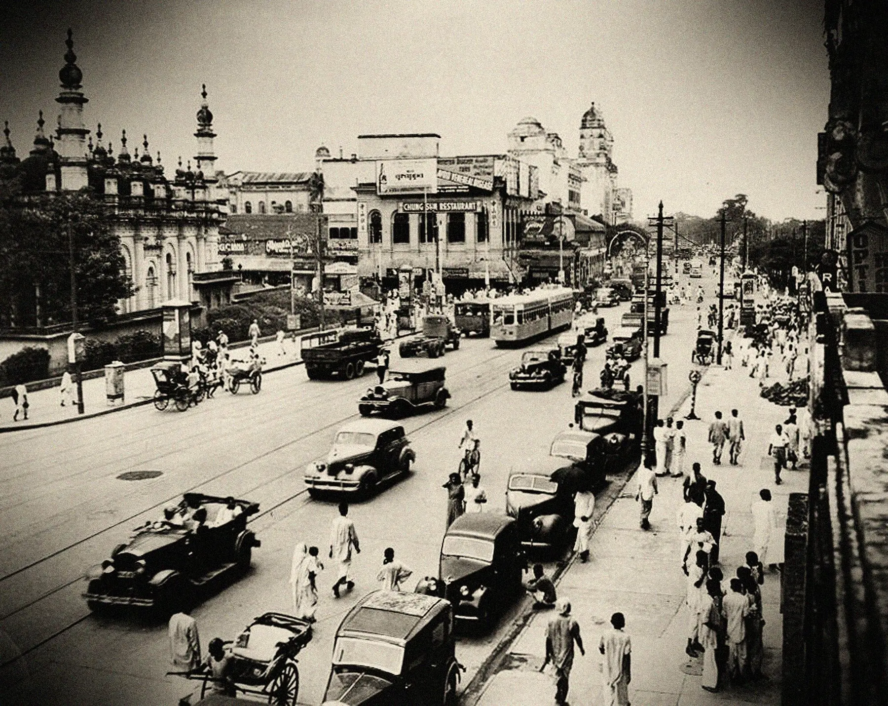
Chowringhee, Calcutta · 1945
Photo: Clyde Waddell, public domain
Since 1967
The House of Kanchana
Tap the letters to open
01 — Logo system
Types of logos
The stamp. Black is always the first choice.
Teal green, used sparingly.
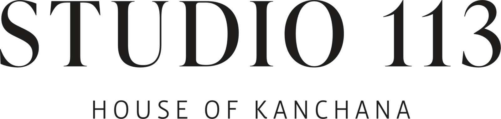
The wordmark. For small sizes, social and over photography.
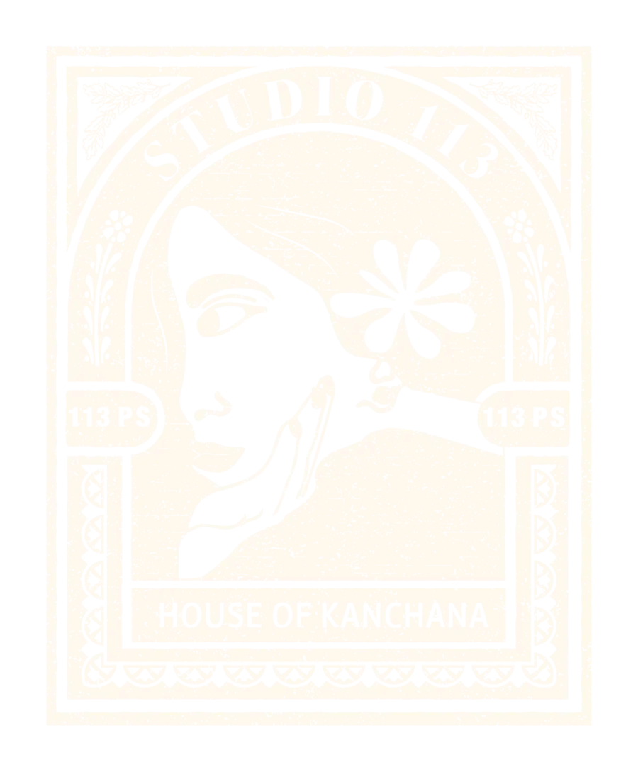
For foil, emboss and single-ink print.
02 — Logo system
Logo grid
03 — Colour
Colours
Black
#0A0A0A
RGB 10 10 10
White
#FFFFFF
RGB 255 255 255
Teal green
#016953
RGB 1 105 83
Floral white
#FFF8EE
RGB 255 248 238
Raspberry rose
#AB4681
Lapis blue
#1F3C75
Alpine
#B5882D
Black and white lead every communication. Teal green and floral white add depth and warmth; raspberry rose, lapis blue and alpine are kept for a glint of colour.
04 — Typography
Fonts
Primary · Regular
Forum
Aa
ABCDEFGHIJKLMNOPQRSTUVWXYZ
abcdefghijklmnopqrstuvwxyz
0123456789
A display serif with Roman inscriptional capitals. Used for headlines, titles and names.
Secondary · Regular to Extra Bold, with italics
EB Garamond
Aa Aa
ABCDEFGHIJKLMNOPQRSTUVWXYZ
abcdefghijklmnopqrstuvwxyz
abcdefghijklmnopqrstuvwxyz
0123456789
RegularMediumSemiBoldBoldExtraBoldItalic
Labels and web
Montserrat Regular
05 — Photography
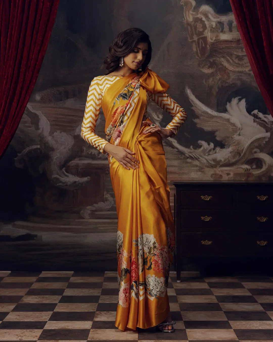
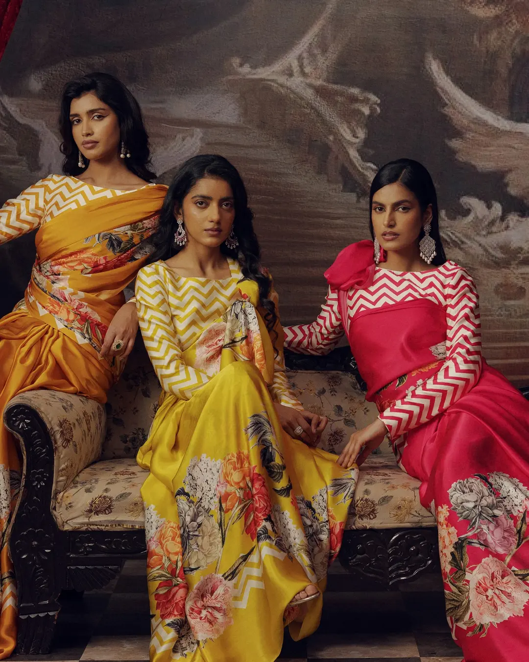
Product images


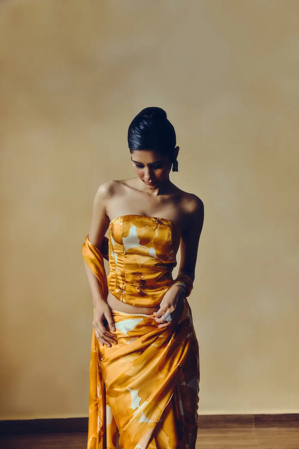
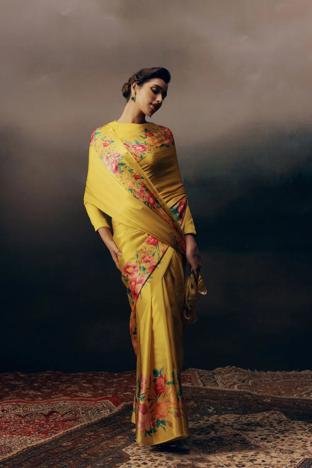
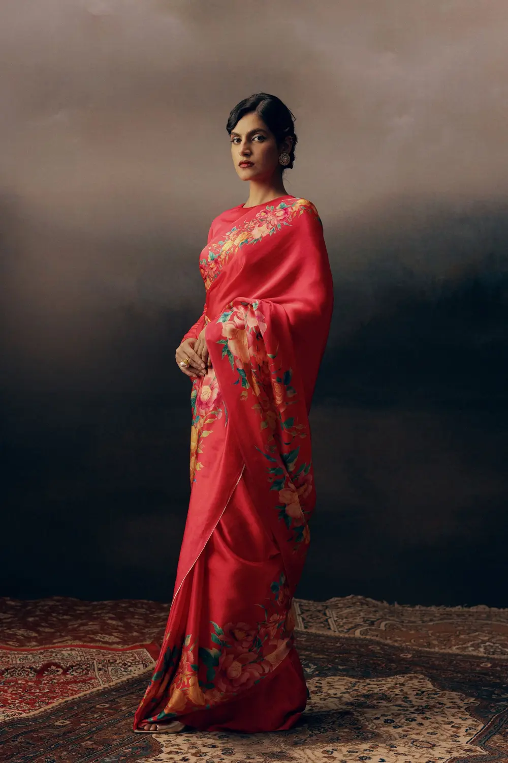
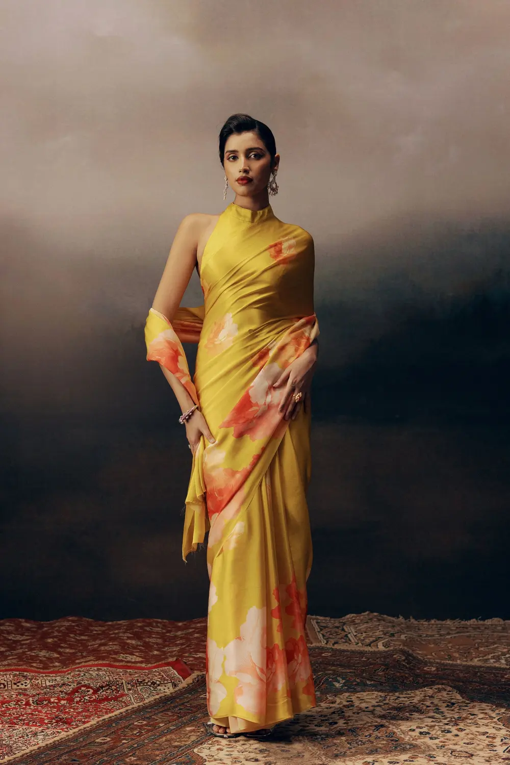
06 — Applications
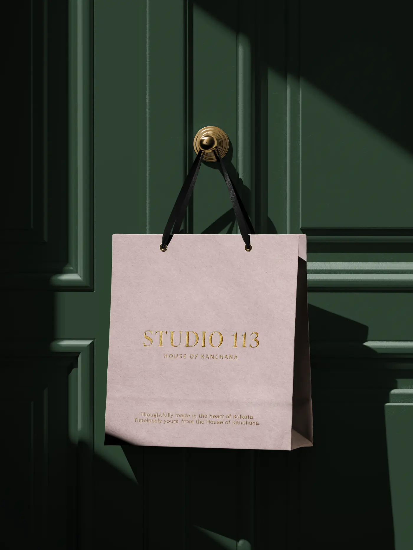
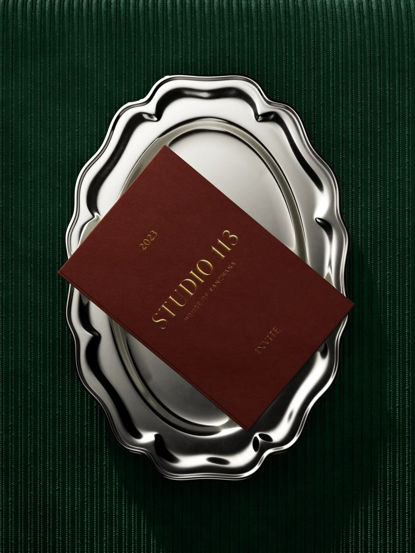
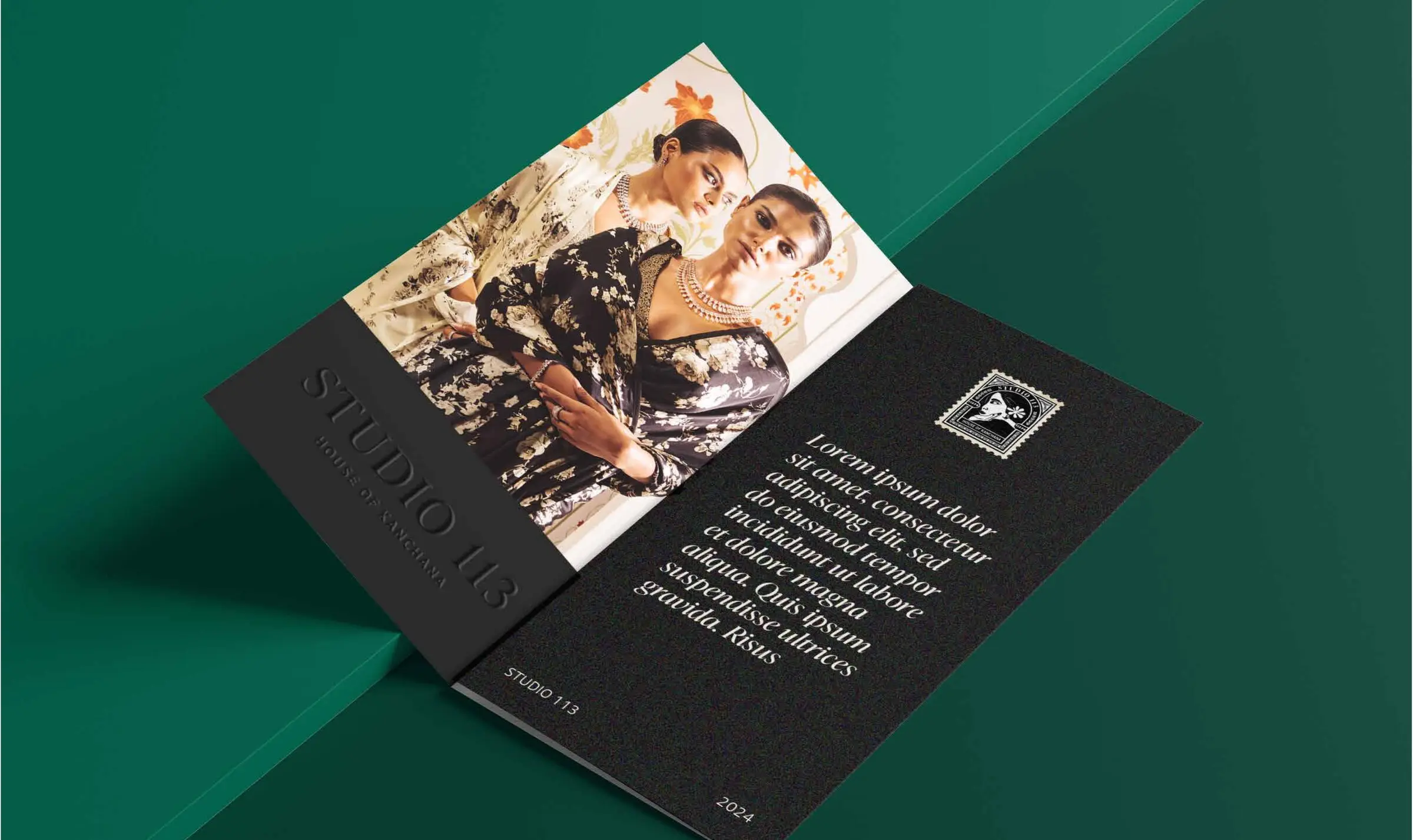
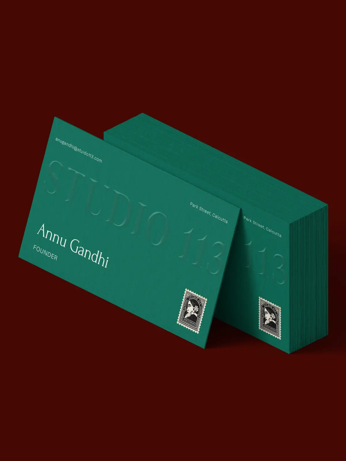
Mockups
07 — Social
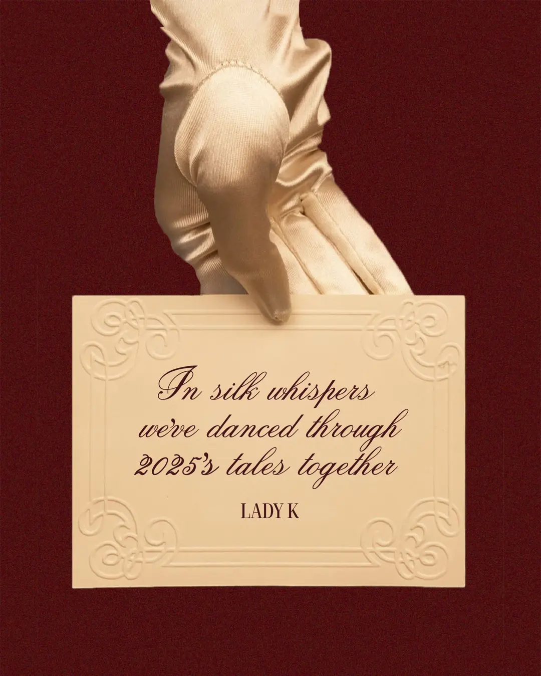
Social media